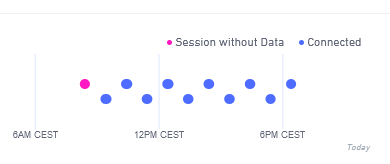
In my use-case I have two devices close to each other that show different behaviours in the chart for “Network Connections in the Last 48 Hours” on hologram dashboard under “Devices”:
and

The first of the two devices is a bit unreliable with sending data and there is obviously a difference. However, the vertical axis in this plot is not specified. For the purpose of trouble shooting the first device: Does anyone know the meaning of the vertical axis in this chart?
This topic was automatically closed 30 days after the last reply. New replies are no longer allowed.